A business should take care of everything that is going to impact its revenue streams. The website is the first and foremost thing that comes to mind when you think about it. Making an impactful website requires the perfect placement of everything. Award-Winning Website Design is both attractive and simple. The navigation, UI UX, CTAs, and Catchy Content with a pinch of SEO, makes it perfect. Let’s figure out the Essential Tips that you must follow.
27 Essential Tips for The Perfect Website Design

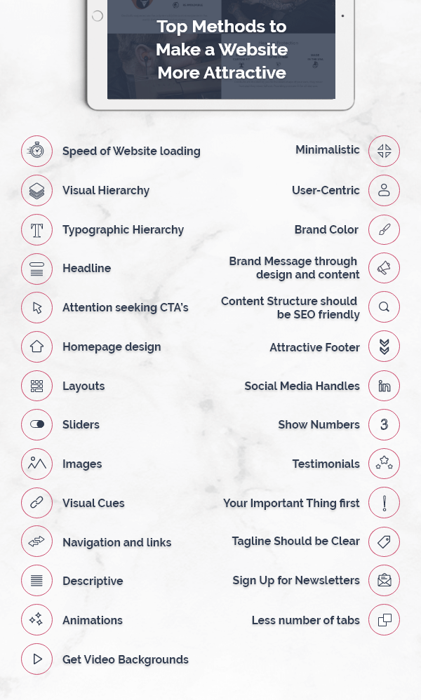
- Speed of Website loading: Typically users expect the website to load in 3-4 seconds if it takes longer than that user starts getting irritated. So the fundamental principle of responsive web designis to minimize the speed of loading the homepage. The speed of loading should be minimized not only for desktop but also for mobile.
- Visual Hierarchy: Visual Hierarchy means the arrangement or presentation of elements in a way that reflects its importance. Order of elements on the website created such that visual contrast of perception of the human eye. Enhance the visibility of content and graphics for Attractive Web design. People usually ignore the low contrast content. The visual hierarchy gives viewers an eye a path to action.
- Typographic Hierarchy:The Website design where the text is involved Typographics hierarchy is an important aspect of Web design services. You should start with 3 levels to organize it. Level one will be the largest in size and should be used for most emphasizing content like your brand name or tag line. Level second is used for the sections or menu which grouped information together.
- 4. Headline: Use a descriptive, keywords focused headline that reflects your work on the top of the Website homepage. The headline must be in bold letters with clear and attractive fonts. Web designers should try to write something descriptive rather than fancy. The headline should be above the fold as visitors spend 80% of the time above the fold.
- Attention seeking CTA’s:The most prominent goal of every website design company is to direct the audience to take specific actions. CTA’s are used for engagement purposes. You must use attractive colors to guide users’ attention towards CTA’s.
CTA can be of many types:
- Lead generation
- Form Submission
- Social Sharing
- Product or service discovery
- Event Promotion
- Sale
- Don’t put all the CTA’s at the top of the Website homepage.
- Homepage design: A strong homepage design can attract visitors to spend more time exploring your services. With the Responsive Website design, you can help the target audience to know your business. The homepage should be tall and answers all the questions of your visitors through design. The homepage must reflect the idea behind your work. The homepage menu should highlight prominent informative pages of the website.
- Layouts: According to the study, the websites that follow standards are liked by visitors more often, so try to stick to standard layouts. The website must have low visual complexity. Some standard layouts like:
- Logo at the top left
- Search option at left
- Menu on the top right
- Social Media buttons at the bottom.
- Necessary Call to action
- Sliders:Sliders are undoubtedly loved by clients but the visitors generally view the first or second slide and skip the rest so it is advised to avoid rotating sliders on the homepage. Since sliders are confusing and also slow down the page which impacts conversion rates. It may reduce the space for other relevant content. Sometimes users skip the slider as they skip the ad. Instead of a slider use one amazing featured image with good CTA’s.
- Images: According to research 37% of the population are visual learners. Image triggers the emotion and makes your website engaging. The image gives visitors the reason to scroll down your Website. Give the data of people connected to your company to a website design company to a website design company so that they can use meaningful images, it helps visitors to trust in your brand. Avoid stock pictures and try to ensure images should not slow down your webpage.
- Visual Cues: Only in 15seconds user decides to leave the website, it shows how fast the user creates the first impression online. Answers to how to build a website are not related to how it looks but also how it works. Visual Cues improve the performance of the Website and also make it interesting. Visual cues should be obvious according to standard UI UX design. Try to avoid distractions and use Visuals to make navigation smoother. Use some extra visuals for CTA’s.
11 Navigation and links: Usually We took Navigations for granted. Navigation basically affects the conversion rate and also has a great impact on loading speed. Try to avoid format based nav. Limit the elements in the menu. Website navigation should be optimized and mobile-friendly. Links are generally to navigate the users to other webpages of the Website.
- Descriptive: Website content should be easy to readable and self-understanding so naturally it can reach a wider audience. Try to stick to an active voice and be descriptive. Make important messages easy to find.
- Animations: Well-framed animation will improve the user experience. Classy and organized animations can contribute more to the mesmerizing and user-friendly website. Basic animation in website design: Loading, Scrolling, Sliders, Feedback, and Welcoming animations. Animations are interesting and engaging until you are not mixing so many animations and making it complex. According to trends flat and landscape animations with less styled design. It should be smooth, not shaky.
- Get Video Backgrounds: As per human nature, it is impossible to ignore moving things. Since videos are more engaging than images and text you must use a video background on the homepage. It can increase the retention time and makes your users understand your services more accurately. Use video background only if you have simple services or products. Try to use short clips and don’t let your video complete with content.
- Minimalistic: Minimal design looks simpler but it is not easier to design. It requires a proper balance of visual and content. Choose the best UI UX design services to help you create the minimal design that never means a lot of negative space but it refers to recognizable visual hierarchy and dramatic typography that engages the users.
- User-Centric: If you are neglecting the users while designing the website you are making a terrible mistake. Build a website from the user’s perspective. You must concentrate on the visibility and accessibility of the website. Hire Web Designers to make it pleasant with the most suitable orientations.
- Brand Color: Visual effects are highlighted due to its colors. Try to use contrast colors on websites. If the color of the logo is bright use dark colors in the Website but keep in mind that your brand color dominates on the designs. An experienced web design company helps you in providing a better user experience.
- Brand Message through design and content: Brand Message is the faces of your brand that attracts users. Perfect combination of Logos, typography, colors, packaging and messaging upholds the reputation of the Brand.
- Content Structure should be SEO friendly: Better the Search Engine Optimization more the chances of Website ranking higher in Search. SEO friendly content structure provides an engaging user experience on the Website. There’s no need to complicate through internal Linking.
- Attractive Footer: Footer is at the bottom of the page and maintains the consistency of the Webpage. The footer should include the terms and conditions, contact form, address, a contact form, Social media buttons and links to popular posts. A footer must be used to present your copyrights and disclaimer.
- Social Media Handles:Social media handles help you in brand promotion. Create social media buttons that must be highlighted on the Website. Buttons should contain links to your social media pages. It should be clearly visible and specific in size. There are various Social media integration tools online that use it smartly to enhance your brand promotion.
- Show Numbers: A basic psychological behavior of humans that numbers attracts more than the text. Be descriptive and genuine while showing numbers as it represents user statistics and builds trust with your Customers.
- Testimonials: Testimonials represent the company’s growth and quality of service. Testimonials must be user- generated content, it increases credibility. Testimonials are informative and help in building trust in the user’s mind. There’s no fixed number for how many testimonials to put on a website but it should reflect your brand image.
- Your Important Thing first: Website creates a great impact on your branding. Websites must show your services clearly as users are only interested in what you could for them. Some important things that a UI UX designer must take care of:
- Product or Service Description
- Contact details in click to call format
- Highlight you unique selling point
- Social media buttons
- Tagline Should be Clear: Tagline is an advertising excerpt for your company. Placed the tagline right below your brand logo. Tagline reflects your quality of services. Brand tagline should be clear, catchy and creative but it must give a simple message to the Users.
- Sign Up for Newsletters –Get the data of users: Newsletter must build to convert Users into your customer. Design a newsletter specific to the theme of your homepage. Newsletters must be exclusive. It also helps in collecting the data of users and to identify your target audience.
- Less number of tabs: Visitors scrolls the website more than they click so scrolling must be smooth and fast and more tabs can slow down your scrolling speed. Visitors need information in descriptive format and the company needs the result.
Conclusion about Website design:
- Easy to find what user’s want
- Beautiful and attractive appearance
- Fast loading speed
- Interactive user experience.
There are yet a lot of elements to be placed perfectly and then make a unique UI UX design. It’s not easy if you are not experienced, so what could be the best alternative?
Hire a web design company that will get it done for you. Yes, a company like CodeLab with deep expertise and 10 years of experience behind Web Design Services can help you out. Not just the great website design, but perfect consultation for marketing it and working on it. CodeLab has got industry experts with them who have crafted amazing websites in the past and lead to huge success for clients. Don’t wait anymore, Your solution is just here. Contact CodeLab now

